Designing a Child's Room: Kid-Friendly But Sophisticated
- mackofalltradesNY

- Feb 2, 2023
- 4 min read
Why do people hire a designer? For rooms like this. While some people may see problems, I, as a designer, like to think of these challenges as opportunities. This room had many "opportunities" when we started, and I was excited to tackle them. Here were some of them, just to name a few:
1) 2 siblings would be sharing a room for the first time in this space.
2) The oldest sibling is a 9-year-old boy and youngest one is a 4-year-old girl. (Needless to say their color preferences, interests and everything else is quite varied.)
3) The room was "petite." Like what I did there? Yep, is a small space. #facts.
4) There was a lack of storage. Kids need storage. People need storage. Actually, when is that not the case? This is an age-old battle that goes back centuries in time. Am I right?!?
5) Mom and dad have great taste and want a room that is for the kids but also elevated and stylish too, so they can grow with it as they get older.
Yep. This was a tall order.
Full disclosure. This room was for some super special clients... my maid-of-honor, Jovannie, her husband, Luis, and their two adorable kiddos, Jacob and Jolie. Truth be told, I would do anything for these four. So when they asked me to design a room for the kiddos as they transition into this new phase in their lives, I was all in. ALL IN. And so honored they asked me.
Then when they described what they needed... I may have had a small panic attack and wondered if I could do it... but I had no choice other than to succeed. They deserve the best, so I was here to deliver it for them. :)
Here is what the room looked like before:
Photo Credit: Luis Irizarry
The room itself was cute, but it no longer served it's purpose. Now that Jolie was moving in too, we needed to expand it and make it work for both of them.
First challenge resolved: Sleeping situation.
We needed a bunk bed. We also needed a bunk bed that was low to the ground because the room isn't particularly tall. So we decided to go with the Pottery Barn's Kid's Mid-Century Twin-over-Twin Bunk Bed. It had mid century flair, but still plenty of room for the kiddos. It was sleek, but durable and chic as hell.
Photo Credit: @MackofAllTradesNY
Second challenge resolved: That navy blue wall.
Anyone who has ever painted a wall dark knows it's a pain in the arse to get back to white. It requires several coats of primer and a whole lot of patience. So instead of fighting it, we went with it. We decided to save some time and money by updating that focal wall to black, which was the perfect gender neutral color and was sleek enough for mom and dad to love it too.

Photo Credit @MackofAllTradesNY
Third challenge resolved: Storage.
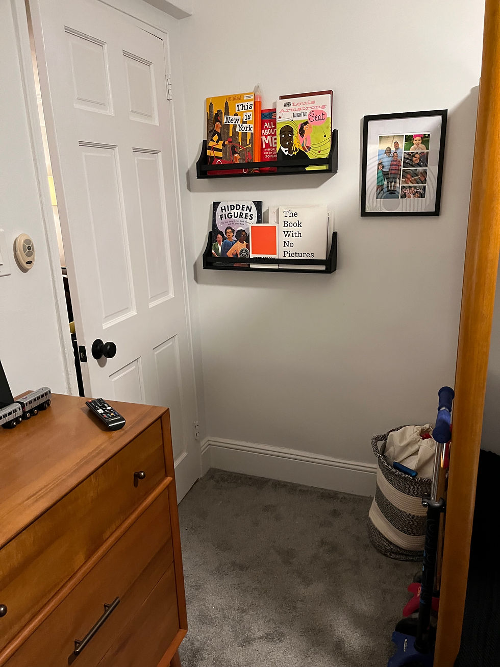
There wasn't much there to start. How we resolved it was bringing in a bigger dresser to store more clothing. We also did some serious purging (Yes, I pushed mom to part with old Halloween costumes that would never be used again. And yes, she obliged.). Lastly we then did lots of cute baskets and open shelving to display the toys in a stylish way. If you can't beat 'em, join em. We made the toys the moment in the room. :)

Photo Credit @MackofAllTradesNY
Fourth challenge resolved: Durability.
Honestly, I'm always keeping this in mind now as I design a space, but in this situation it was extra important. Kids can do some serious wear and tear on a space, so we had to think about maintenance. We went with all white sheets which some may say is counterintuitive but they are easy to bleach clean if need be. We also went with a washable rug from Ruggabble. Most people think you can't put a rug in a room with carpet. Wrong. You definitely can, just make sure it's a low pile rug. Trust me. it's a game changer.

Photo Credit @MackofAllTradesNY
Last Challenge: Pattern.
We needed some design to still make it fun for kids. Plus when you do just black and white, without pattern or texture, a room can really fall flat. We needed to make sure that this was still a space that would inspire creativity in the kiddos.
The focal point was obviously the giant wall decal of the black and white arch. It gave nods to a rainbow, or the circles on top a Mickey Mouse vibe, but was still left open for interpretation. We infused a lot of other pattern and texture as well. We went with a very small, black and white pattern on the curtains which was reminiscent of a child's sketchbook. We also added fun throw pillows to each bed to bring in some color and distinguish which bed belongs to which child. And of course we brought pattern in with the tiger on the rug. I mean who doesn't love a tiger pattern?!?

Photo Credit @MackofAllTradesNY

So alas, here is the space. I'm curious to get your take on it and see whether or not I was able to deliver on all these asks. Enjoy!
Forever Grateful,
Mack


Comments